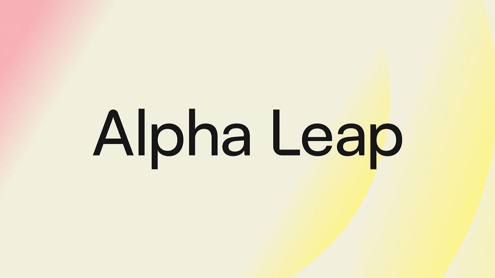
A brand that means what it says
- Jennifer Jensen

- Mar 12
- 2 min read
Updated: Mar 16
We did not rebrand because something went wrong. We rebranded because we finally knew enough about who we are to get it right.
Most rebrands come with a press release full of words like reimagined, evolved, and future-forward. This is not that.
We updated our brand because our old one did not reflect who we are or who we work with. When Alpha Leap was founded, the identity was built before we had fully figured out our own voice. The visuals, the tone, the positioning — they were placeholders dressed up as decisions. We have been doing the work long enough now to know better, and the brand needed to catch up.
Built for the people who are tired of the noise
The AI space is loud. It is full of vendors promising transformation, consultants selling frameworks, and companies slapping "AI-powered" onto everything they touch. Our target groups have heard the pitch. What they want is someone who will tell them the truth: what AI can actually do for their business, what it cannot, and what it will take to get there.
That is what we do. And I wanted a brand that looks and sounds like a company that does exactly that.
"People we want to reach are smart and creative. This brand is created for them."
— Jennifer Jensen, Head of Operations & People


What the identity means
The visual identity starts from black, white, and light grey. Not because we ran out of ideas, but because we do not need to compete for attention through colour. When colour does appear — and it does — it is a deliberate choice, not a default.
The arch in our logo represents the leap a company makes when it commits to adopting AI — the kind of structural change that actually moves the needle. Alpha Leap is named for exactly that: not incremental improvement, but the biggest move a business can make. The patterns that run through our identity echo that shape. They are rooted in mathematics, which felt right, because AI is mathematics. Not magic, not transformation theatre — mathematics applied to real problems.
The identity is also built to travel. Alpha Leap will not be the only thing we put our thinking behind, and the brand is designed to carry across future work without breaking.
I wanted a brand that is immediately legible to the people who need what we offer — and immediately dismissible to the people who do not. That is a feature, not a flaw.
The making of it
The brand was built by Oscar Stridfeldt, UX and Graphic Designer, who brought both the rigour and the creative range the project needed.
"Alpha Leap doesn't fit neatly into a box, so I got to explore, experiment and push ideas a bit further.
— Oscar Stridfeldt, UX & Graphic Designer
A correction, not a crisis
This was not a pivot. It was not a response to something going wrong. It was a correction — we knew more about who we are than our old brand communicated. Now we have fixed the gap.